So it's not technically Wednesday, but since I couldn't get this up yesterday why should you have to wait a WHOLE week?
For this edition of Wedding Wednesday, I thought I would share the details of my wedding invitations. Once the date was set and the
venue booked, I started searching for the perfect stationary. A few things I kept in mind were our color palette (blue, gray, and yellow), the time of year (late spring), and our venue (a Southern plantation). First I checked out
Wedding Paper Divas and liked this design:
I liked the rustic font, but the marsh wasn't the right fit. I searched through
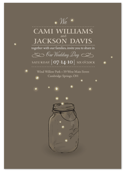
minted. as well and found their selection wonderful. Since I knew we would be using mason jars for our centerpieces, I fell in love with this mason jar and fireflies design:
There were so many options, but I kept admiring my friend
Anna's invitation:
She used a Texas-based company called
Three by The Quill Pen that do invitations, photography AND hand painted signs! When I went to their site, I instantly fell in love with this invitation:
 |
| the response card is a postcard! |
Once Tay and I decided this was THE one, I started working with their senior graphic designer Chandra Chen. Their team was incredibly helpful and patient with me as I changed up the type color (to dark gray & yellow) and picked out the perfect "belly band," which is the the pretty paper that holds the invitation and response card together. Chandra recommended using
Paper Source to find the right band paper and these were my initial favorites:
Top row:
Cherry Blossom White on Yellow Fine Paper,
Gold Leaves on Turqouise Fine Paper. Bottom row:
Yuzen Mums Curry Pool & Gravel Fine Paper,
Yuzen Gold Overlapping Circles on Curry Fine Paper.
It came down to the two choices in the bottom row and eventually I decided to go with the Yuzen Gold Overlapping Circles. This might be a silly detail, but it was very important to me for the postage to go with the color scheme. I even thought about special ordering vintage stamps- which would have cost a fortune! I sifted through the USPS website and found
these beauties:
They looked much more eclectic than the usual wedding band or wedding cake stamp (is that snobby?). Anyways, once the belly band paper was decided, the stamps chosen, and the wording for the invitation finalized I placed the order and waited
patiently anxiously excitedly for them to arrive! They required a little bit of assembly- placing the stamps on the response card, putting the belly band around the two pieces of paper and having the envelopes addressed. Wanna see the final product??
Again, I was so pleased with
Three and will always cherish our wedding invitations. My only regret? I forgot to have them photographed at the wedding! If you're planning your own wedding, I would definitely put a bridesmaid in charge of bringing the invitation so that your photographer can get the gorgeous shot!
And just for fun, here are some of my favorite paper goods all via
OnceWed...
 |
| a telegram! from this wedding |
 |
| a gorgeous illustration from this wedding |
 |
| invitations printed on wood! from this wedding |
xoxo


 They looked much more eclectic than the usual wedding band or wedding cake stamp (is that snobby?). Anyways, once the belly band paper was decided, the stamps chosen, and the wording for the invitation finalized I placed the order and waited


No comments:
Post a Comment